Let’s Talk About Color 2022
We have been seeing a few sneak peaks at paint companies anticipated color trends for 2022. We had to to dive in to some research so that we could share these beautiful colors with you!
There are definitely a few noticeable trends connecting many of these colors across all different companies. 2022 colors focus on refreshing traditional, classic colors in a way that feels nostalgic, welcoming, comfortable, and relaxed. There is a firm focus on amplifying natural light. In contrast, we see a modern take on primary colors in many of the palettes listed below...how fun!
HGTV Home with Sherwin Williams
Sherwin Williams Color of the Year 2022 has already been announced! Aleutian is a balanced tone that sets a restful tone. Since it is grounded in both warm and cool tones it brings relaxation to any space.
The Softened Refuge Color Collection really focuses on sophisticated, soft neutrals with just a *hint* of color. They are simple, focused, and take a "less is more" approach. Many of these colors also attract natural light, which is highly advantageous in the design world. We are really impressed with this natural and calm color palette!
Pantone
While Pantone has not yet announced their color of the year for 2022, the did put out a "Color Forecast" for 2022. This forecast focuses on soothing and timeless hues that strike the right balance between serenity and exuberance. In contrast, the did have some fun with the colors they picked by including vibrant primary colors that invoke a retro vibe, and some playful pastels as well.
Vibrant Primary Colors
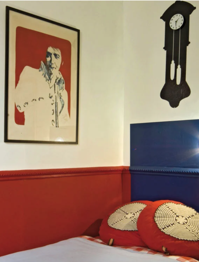
Experiment with these bold colors in your furniture and accents with white walls for a dramatic pop of color.
Familiar Neutrals
Relaxation, soothing comfort, clean, simplicity
Soothing Nature-Inspired Hues
Establishes calm, focus on wellness.
Valspar
"Nature inspired, awe inspiring"
This is a direct quote from https://www.valspar.com/en/colors/colors-of-the-year. For 2022, Valspar really wanted to focus on trendy, yet timeless colors that have a calm, and comfortable presence.
Behr
Another company that has already announced their color of the year for 2022, and we LOVE this one!
Breezeway is a relaxed, uplifting color that invokes peace and tranquility. This color naturally harmonizes with white, gray, and natural wood tones for an effortless style. "Where a breath of fresh air meets a coat of fresh paint".
Farrow & Ball
We love Farrow & Ball paint, and their color picks for 2022 definitely do not disappoint. These colors bring a comforting sense of nostalgia and evoke virtues of a simple life. There is also a focus on elevated primary colors.
Babouche No. 223
Sunny, but can be intense. Pair with a creamy off-white to balance
Schoolhouse White No. 291
Timeless, inviting, traditional
Breakfast Room Green No. 81
Slightly warm green, refreshing, happy
Stone Blue NO. 86
Vintage and contemporary, timeless, antique
Incarnadine No. 248
Pairs well with dramatic hues or juxtapose with white for a graphic effect
PPG
The PPG Color of the Year 2022 is Olive Sprig.
This is a soft, gray-green that is soothing, bright and refreshing.
Still awaiting Benjamin Moore's Color of the Year! They plan on announcing the color October 13, 2021.
Let us know what colors or themes you like the best! As always, you can reach out for help with your projects or with any questions by email.
Until next time,
Kelly O’Neil


